BKK Pay&Go Validator – interface overview

About the Project

Pay&Go is BKK's upcoming open-loop ticketing system, allowing passengers to purchase and validate public transport tickets using contactless bank cards and mobile wallets.

Working directly with BKK, our team explored whether ticket validators could communicate entirely through visual language, eliminating the need for written instructions and making the system more accessible for international travellers.

Project type Role Industry Tools Duration Other info
UX Research, Interaction Design UX/UI Designer Public Transportation Figma, FigJam February 2025 - May 2025 University collaboration with BKK. Team members: Hajnal Mészáros, Liliána Bitó.

The Challenge

Public transportation systems rely heavily on written instructions. However, cities welcome millions of visitors every year who may not understand the local language.

  • Validators must communicate quickly.
  • Passengers have limited attention.
  • Interactions happen in crowded environments.
  • Tourists often do not speak the local language.
  • Feedback must be understandable within seconds.
"Can a ticket validator work without any text?"

Research

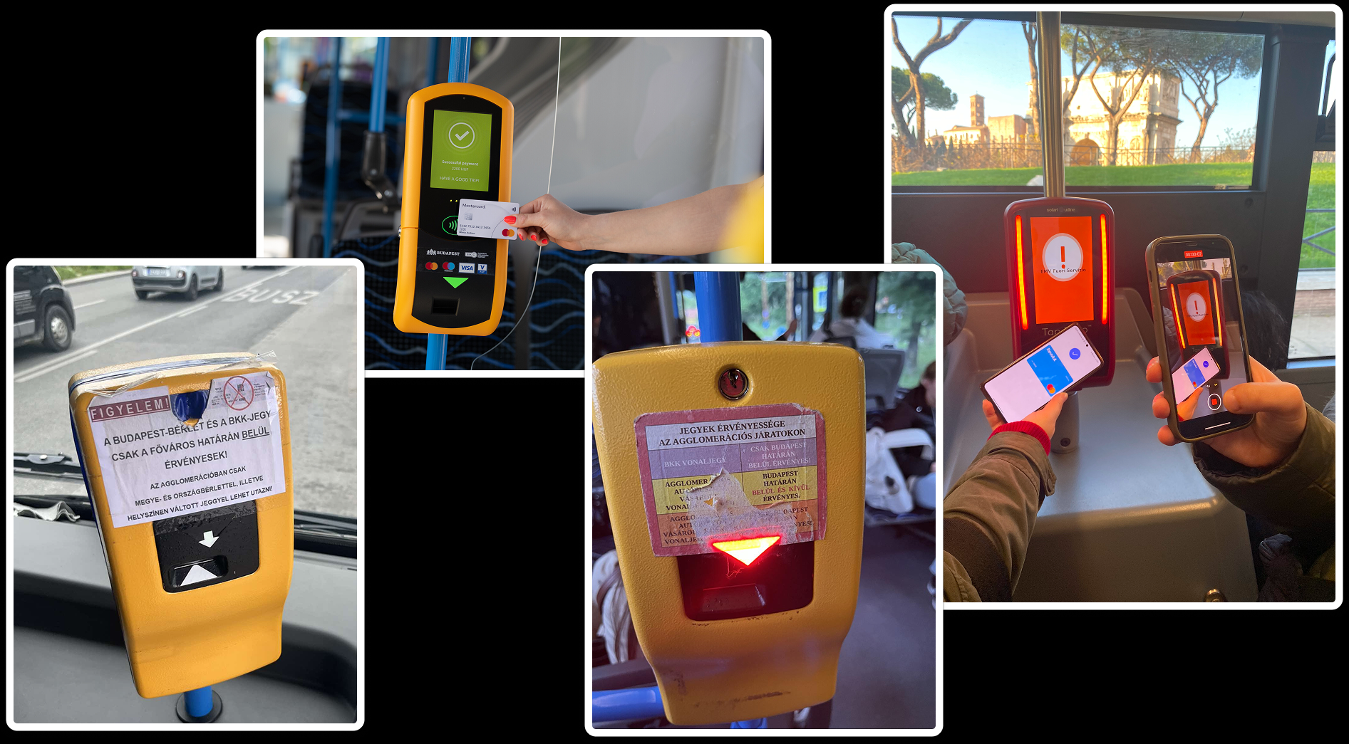
To understand whether a validator could function without written instructions, we first examined the current ticket validation experience across Budapest's public transportation network. We documented existing validator interfaces, printed information materials, ticket purchasing instructions, and suburban fare explanations to better understand what information passengers rely on during their journeys.

In parallel, we analyzed open-loop ticketing systems used in other European cities to identify common interaction patterns and approaches to communicating validation, payment, and fare information.

Existing Systems Research

Mapping Information Needs

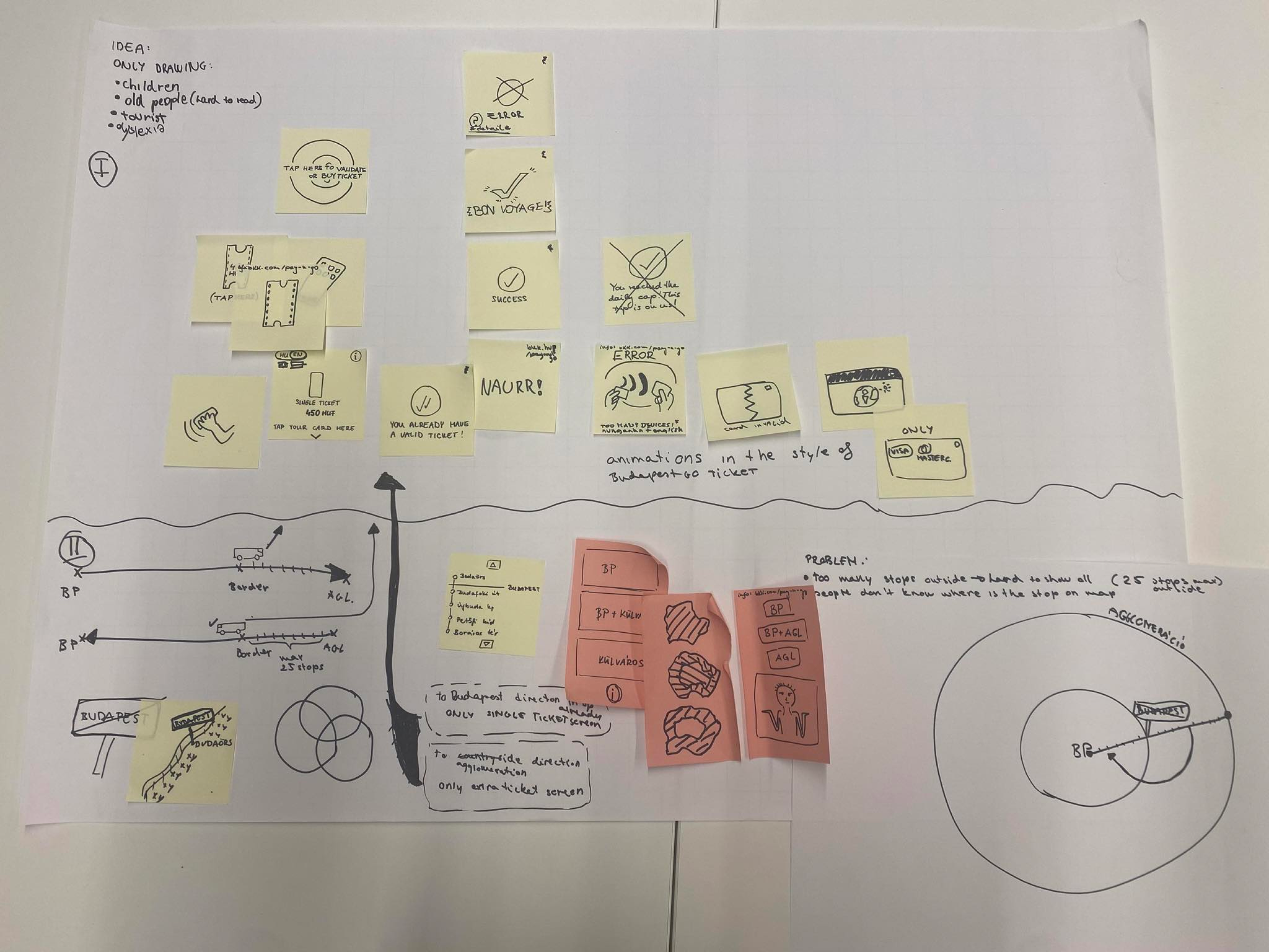
Based on our observations and findings, we mapped the information passengers encounter throughout the validation process. Through collaborative workshops, brainstorming sessions, and rapid ideation, we explored which pieces of information are essential and how they might be translated into a purely visual language.

Brainstorming Session

Animation Exploration

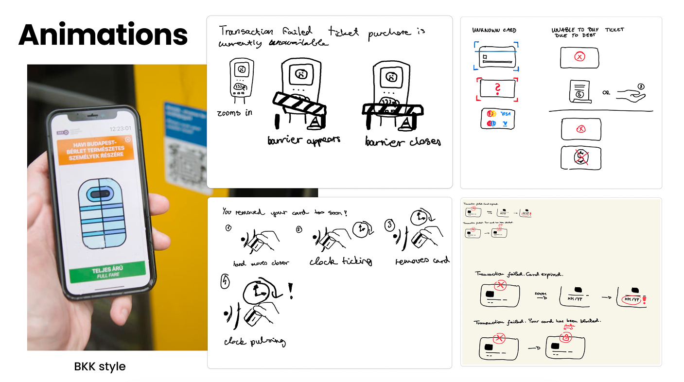
One of our earliest concepts focused on using animations to guide passengers through the validation process without relying on text. We quickly sketched and tested several animated interactions to communicate ticket purchases, validation states, and system feedback.

While participants generally understood the intended messages, testing revealed that animations introduced unnecessary delays. Public transport interactions happen within seconds, and users expected immediate feedback rather than waiting for explanatory sequences to play out.

Animation Concepts

Testing Existing Iconography

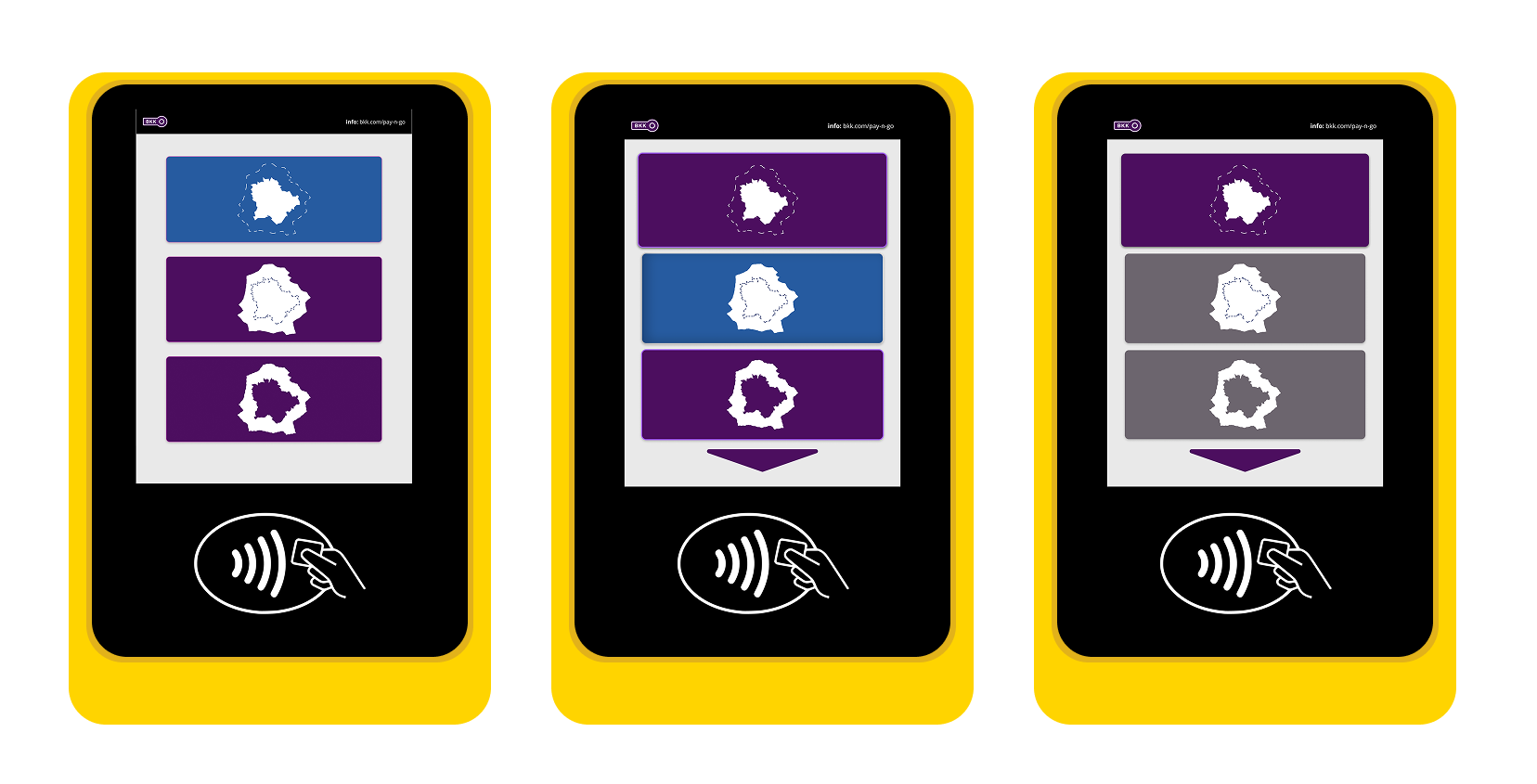
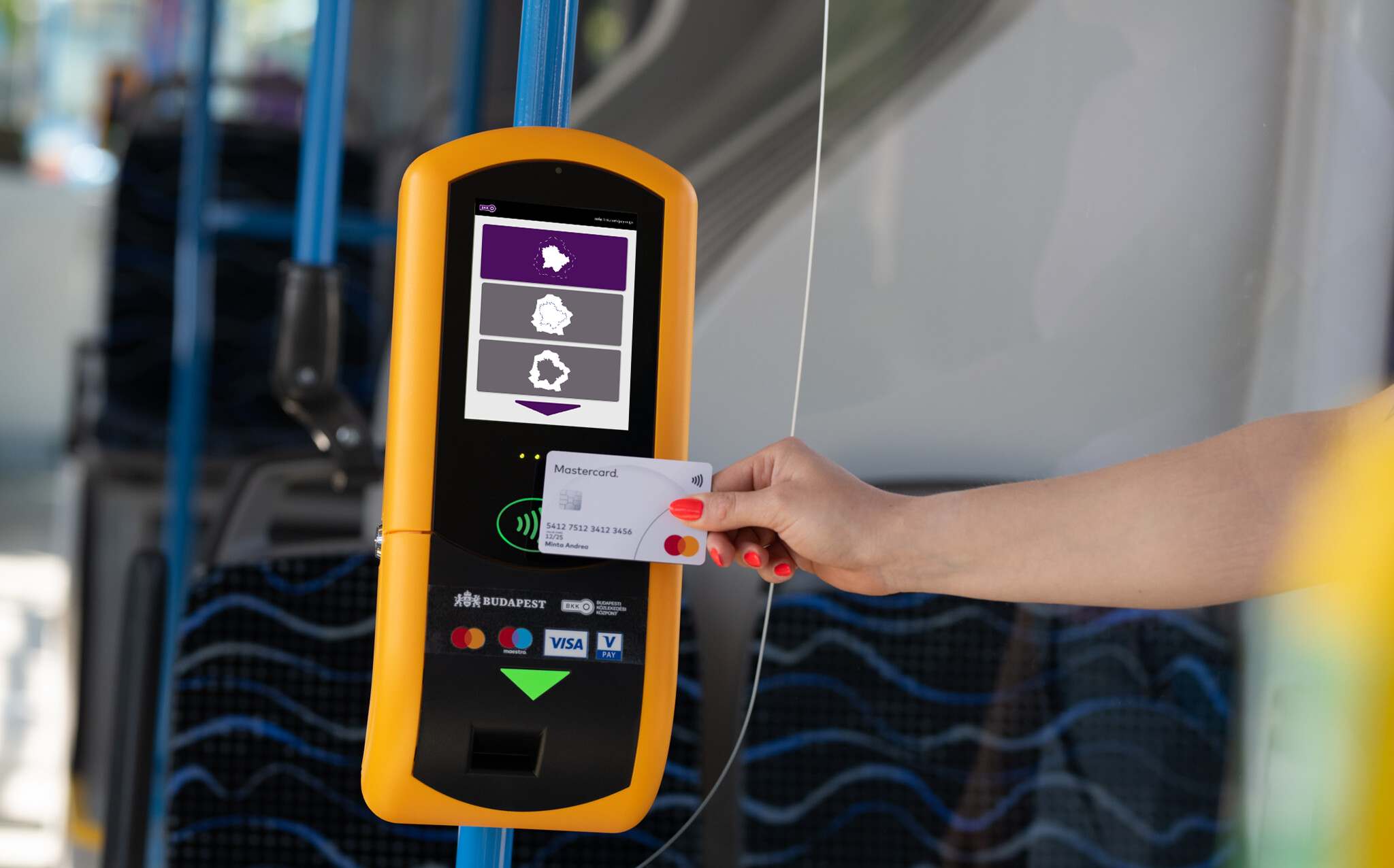
Since animations proved unsuitable for fast-paced validation scenarios, we shifted our attention to static visual communication. We explored whether BKK's existing iconography could effectively communicate validator states and error situations without the support of written language.

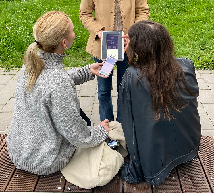
Particular attention was given to error feedback, as failed validations often occur in public settings where passengers may already feel rushed or uncomfortable. We tested for example how to show validator isn't working.

Iconography Testing Iconography Testing 2

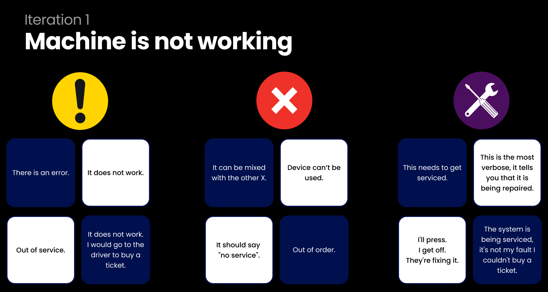
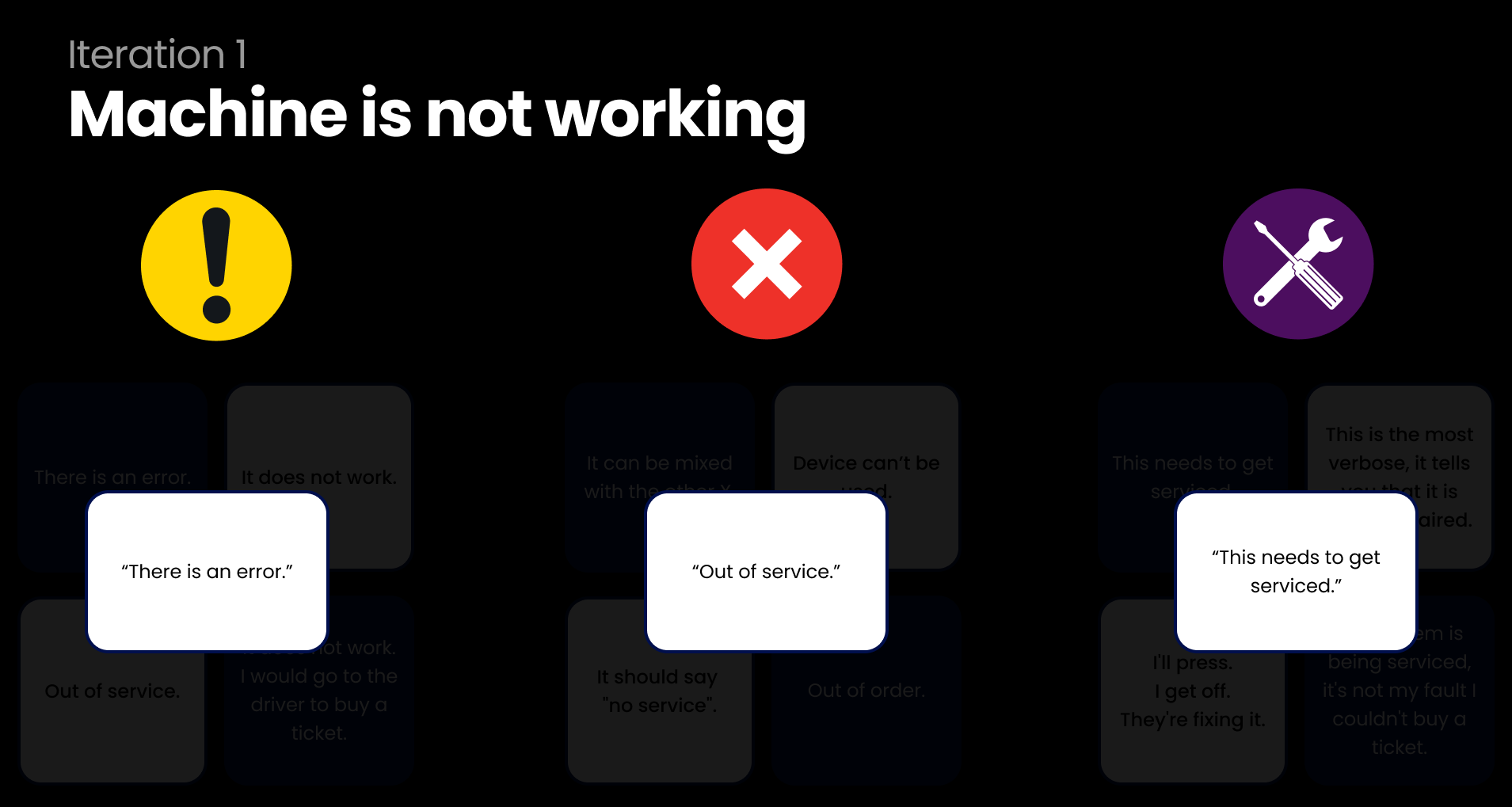
To evaluate the effectiveness of the visual language, we tested multiple symbols and feedback states with users. Participants were asked to interpret the meaning of different icons and describe the actions they would take based on the feedback shown by the validator.

The results highlighted significant inconsistencies in interpretation. Symbols that appeared obvious from a design perspective often conveyed different meanings to different users, demonstrating the challenges of creating a truly language-independent validation experience.

Testing Process

Key Findings

Testing revealed several challenges when relying solely on visual communication.

Animations Are Too Slow
Users needed immediate feedback. Even short animations delayed understanding and slowed interactions.
Public Errors Feel Uncomfortable
Error states such as insufficient balance created anxiety when displayed publicly. Users preferred more discreet feedback.
Existing Icons Lack Consistency
Many existing transportation symbols were interpreted differently by different users, reducing clarity.
Some Decisions Require More Context
Choosing between city, suburban, or combined travel proved difficult to communicate through icons alone.
"Visual communication can simplify validation, but not every transport decision can be reduced to a single symbol."

Main User Flows

Single Ticket Purchase
Buying a ticket and receiving success or error feedback.
Multiple Tickets
Purchasing tickets for several passengers using a single device.
Suburban Travel
Selecting travel zones for Budapest, suburban areas, or both.
Information architecture

Design Iterations

We tested multiple approaches including animated instructions, sequential feedback systems, icon-based communication, and simplified status indicators.

One of the main flows were the agglomeration selector screen, which had multiple iterations is shown below. Even with the last one users had difficulties, which highlighted the challenges of communicating complex information without text.

Iterations

Outcome

While our research showed that many validator interactions can be communicated visually, fully eliminating text introduces significant challenges for more complex scenarios.

The project provided valuable insights into accessibility, cross-cultural communication, and the limitations of iconography in public transportation systems.