Design process
Our work process can be divided into four main steps, with all of us actively involved in each one, ensuring an equal contribution from everyone.
- Reviewing the brief.
- Reviewing the brand guidelines.
- Reviewing competitor solutions
- Defining groups of information.
- Defining functions.
- Rapid paper wireframing.
- Brainstorming and brainstorming and even more brainstorming.
- Quick and dirty prototyping to try out ideas.
- Listing possible new features.
- Prototyping in Figma.
- Ensuring alignment with the brand guidelines.
- Considering accessibility factors.
- User testing.
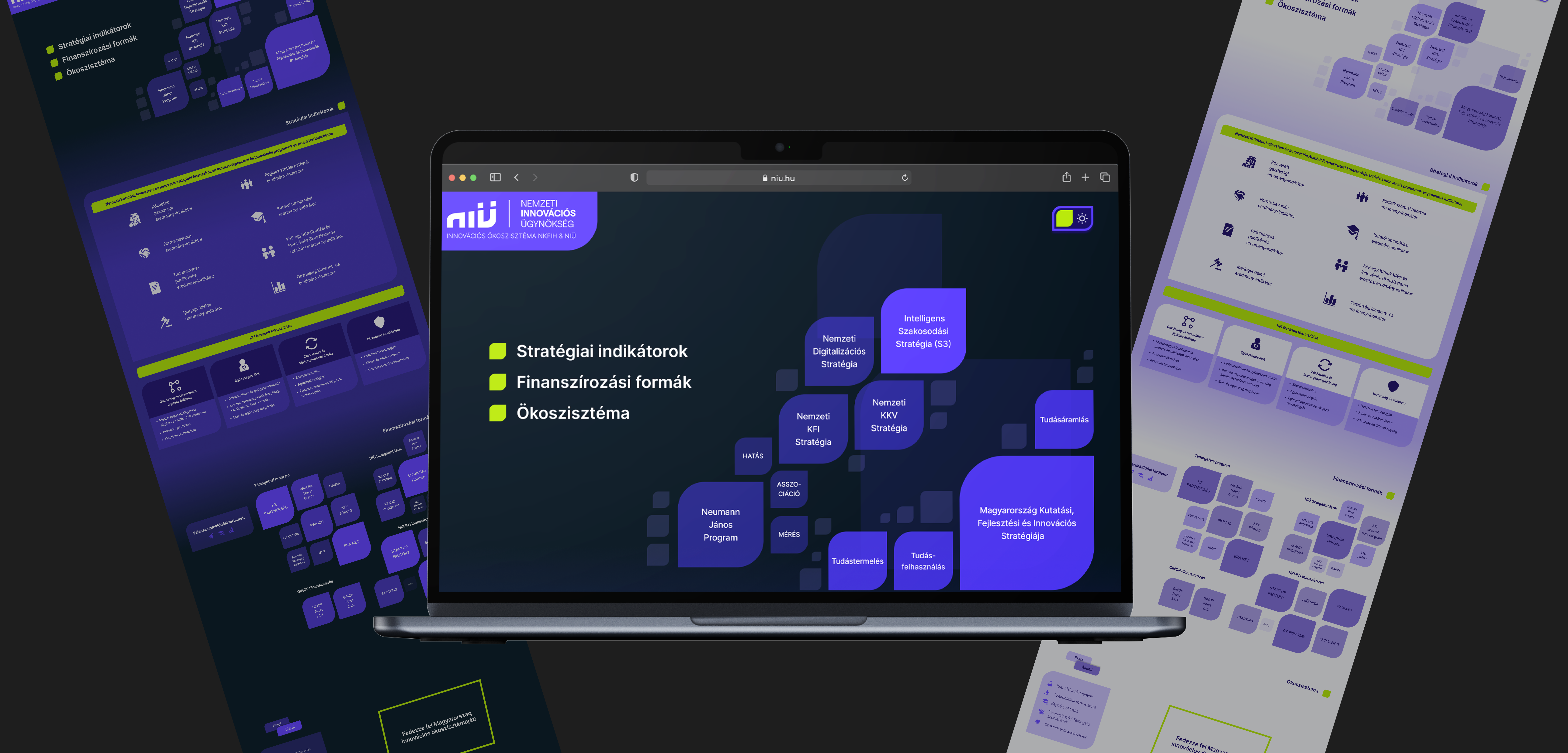
As mentioned earlier, the Hungarian Innovation Ecosystem Map already existed, so our task was to redesign it. To highlight our work and the changes, I've put the old and new versions side by side.
Changes in the UI
Here are some of the initial changes we made to the UI of the map. I cut out the different sections to better show our solutions and the original problems.
Hero section, actors of the ecosystem
In the old version, it was really hard to recognize the actors' relations within the ecosystem and their hierarchy. It wasn't clear which element was clickable, and even if you guessed correctly and clicked on an actually clickable element, an almost full-screen modal popped up with some info and a link.
In our solution, we used the size and opacity of the elements to show how significant each ecosystem unit is. We also brought closer the units that are connected to each other. Clicking on an element enlarges it to display details about the actor/unit along with a link to their website. Additionally, we added navigation to make it easier to find other sections, such as strategic indicators, financing options, and the ecosystem.
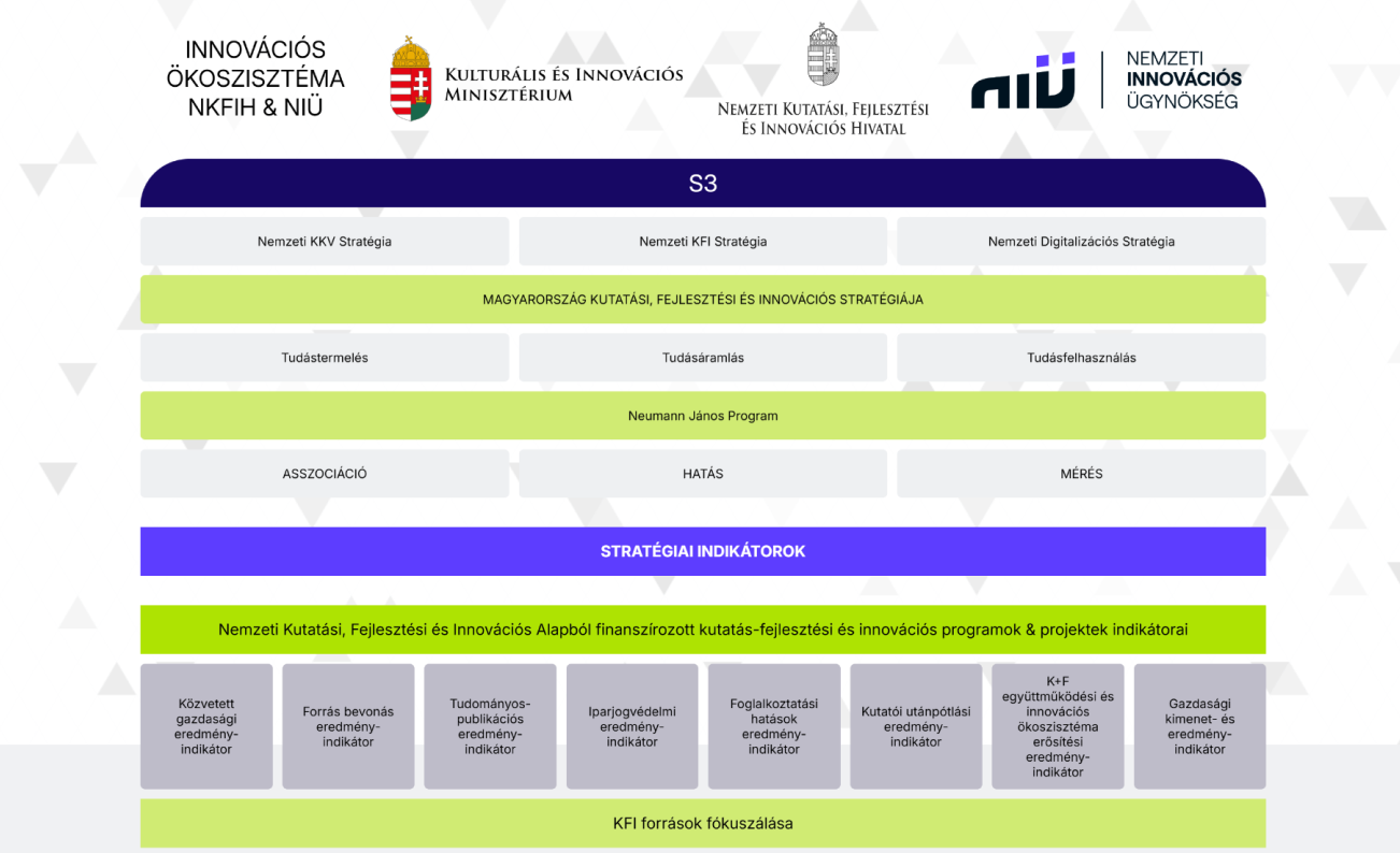
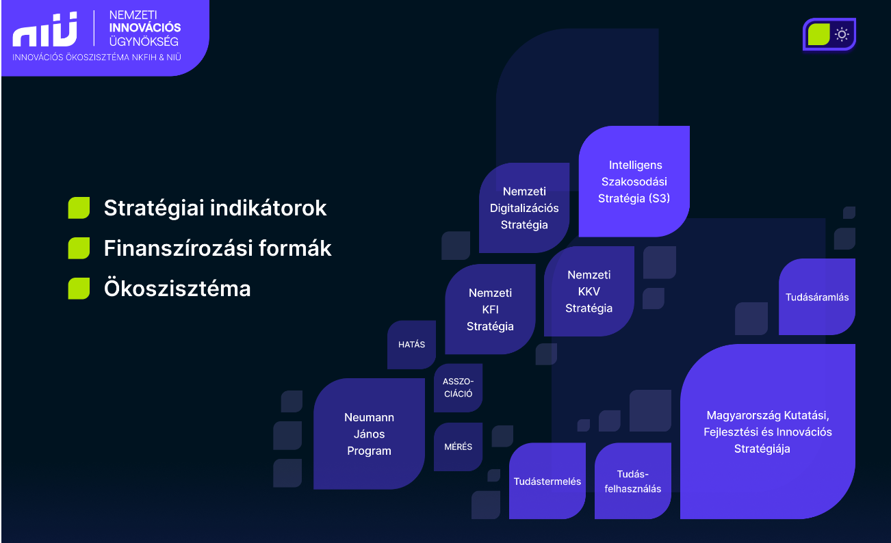
Strategic indicators
In the old version, it looked like this section was merged with the introduction of the ecosystem players. This section is absolutely not clickable, but because it looked like the section above, it was not clear to the user.
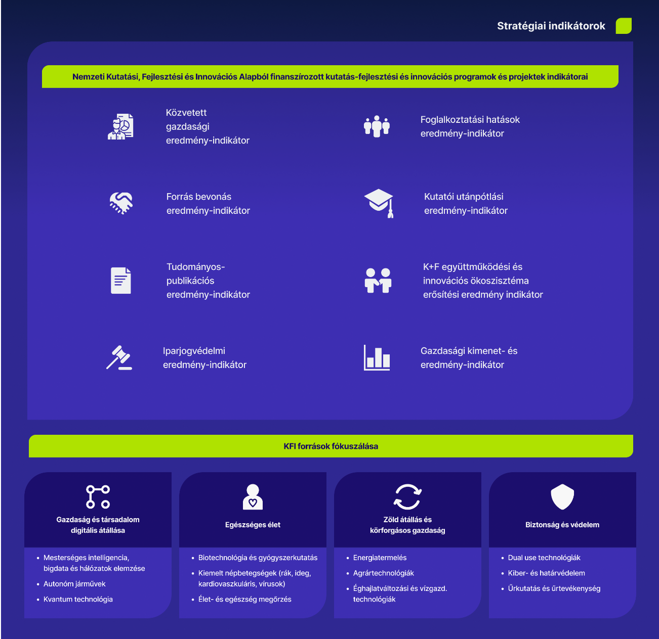
In the new version, we tried to make this text-heavy section more consumable and understandable by using icons. We got rid of the centre-aligned text and made lists to make it easier to understand what goes together and how.
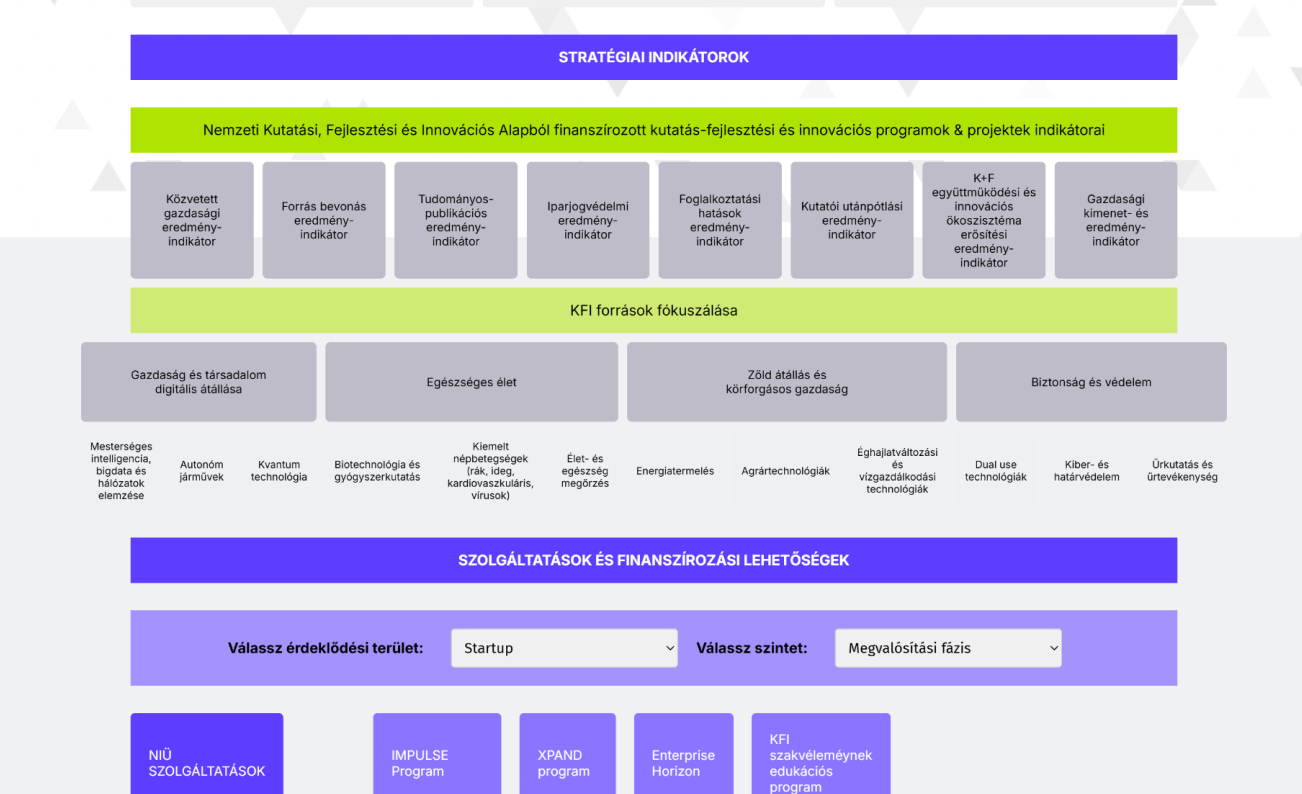
Services and funding opportunities
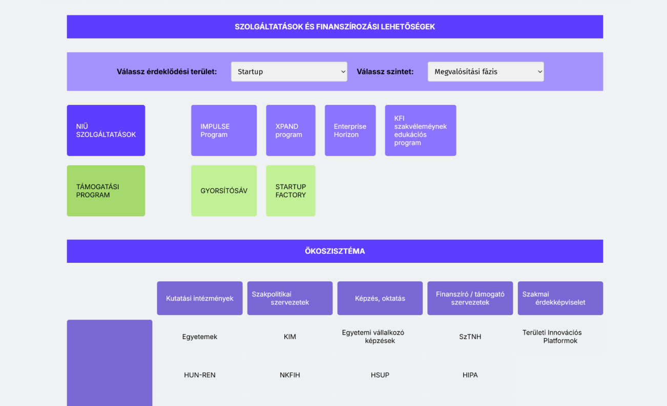
In the old version, if the user wanted to check what kind of funding option they could have, they had to choose from two drop-down menus, and only after that could they see the funding options they could go for. As a user, you had to choose from both drop down menus, if you chose your preference from only one, there was no listing of available funding. So, for example, if you were looking for financial support for start-ups, only after selecting from the second drop-down box could you see that you were in the implementation phase.
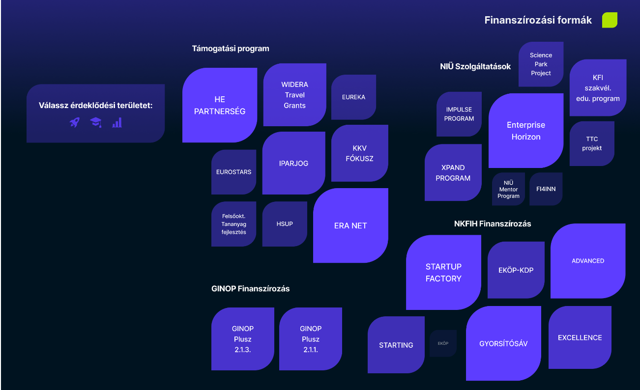
In the new version, we went for a visual approach: by default, you could see all the available support options, and the size and opacity showed the probability that the option would be good for the user. (On the right, the user can filter in a visual and entertaining way. Again, we got rid of the pop-ups and used the same method as for the actors above: when you click on an element, it gets bigger and shows the details and a link that takes the user to the right website.
Ecosystem
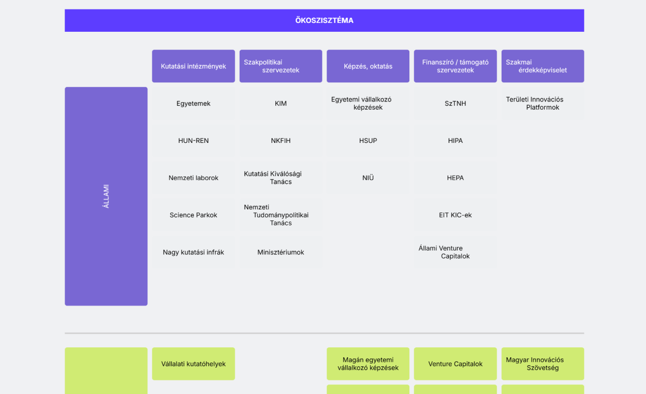
In the old version, the user could not see the whole ecosystem at once, which made it quite difficult to remember which column represented what. To get more information about a device, the user had to click on it and a pop-up would appear on the screen, as usual. So the same problems occurred as mentioned above.
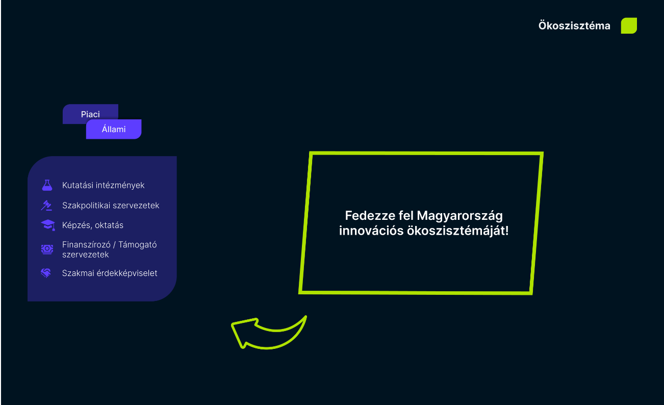
In the new version, we tried to create an interactive screen to explore the ecosystem. There is no need to scroll, you can see everything on the screen and with the navigation on the left it is easy to find your way around. To see how it works, we suggest you watch the video below.
Final Deliverables
To showcase the interactions, we created a short presentation video that walks through the entire redesigned ecosystem map. If you’re unable to play the video here, you can watch it on YouTube using the following link: Watch here!